The story
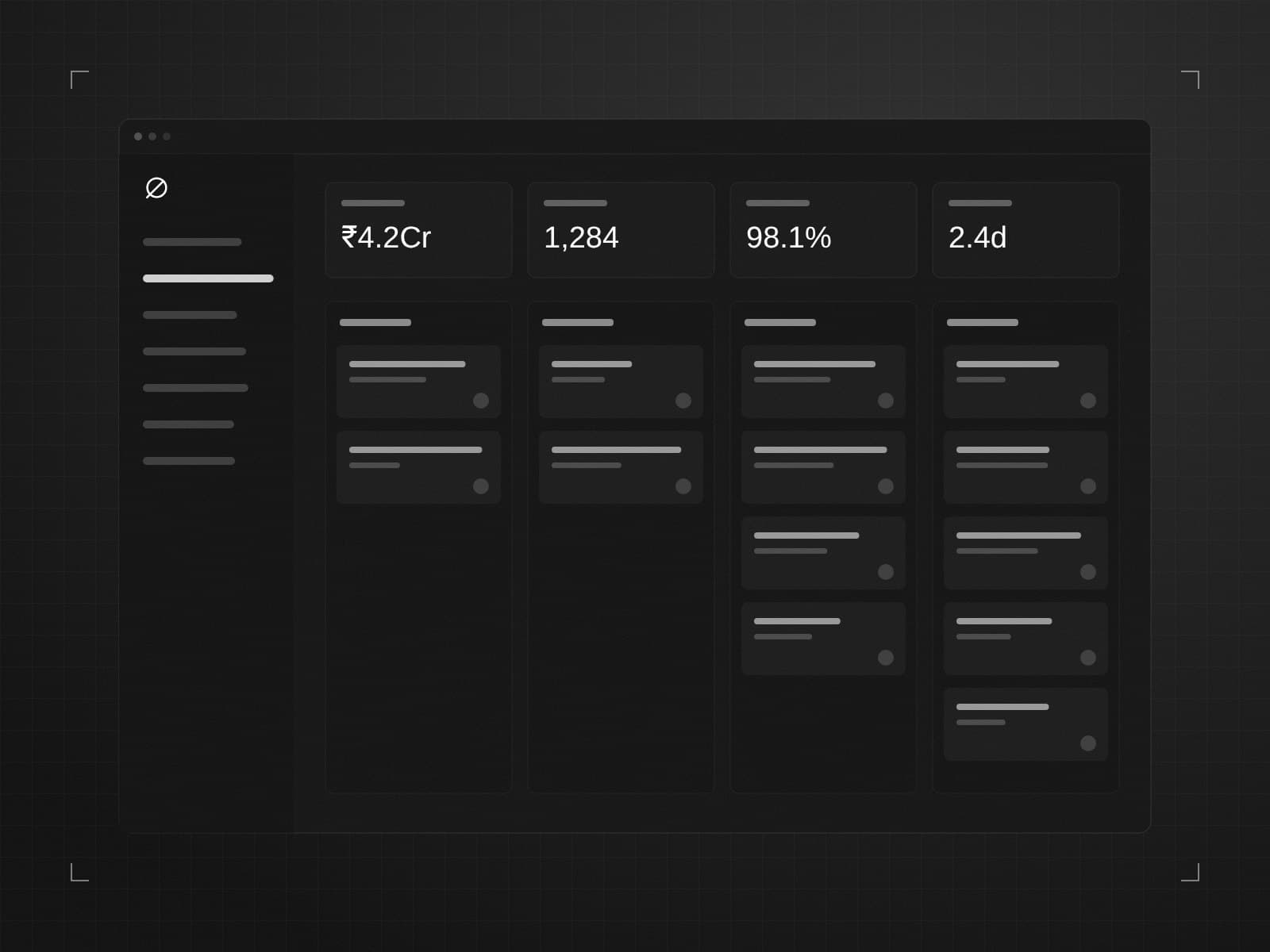
The client's operations team was the engine of the business — and their tools were holding them back. Every loan application passed through a dashboard built years earlier, patched by several different vendors and never designed as a whole.
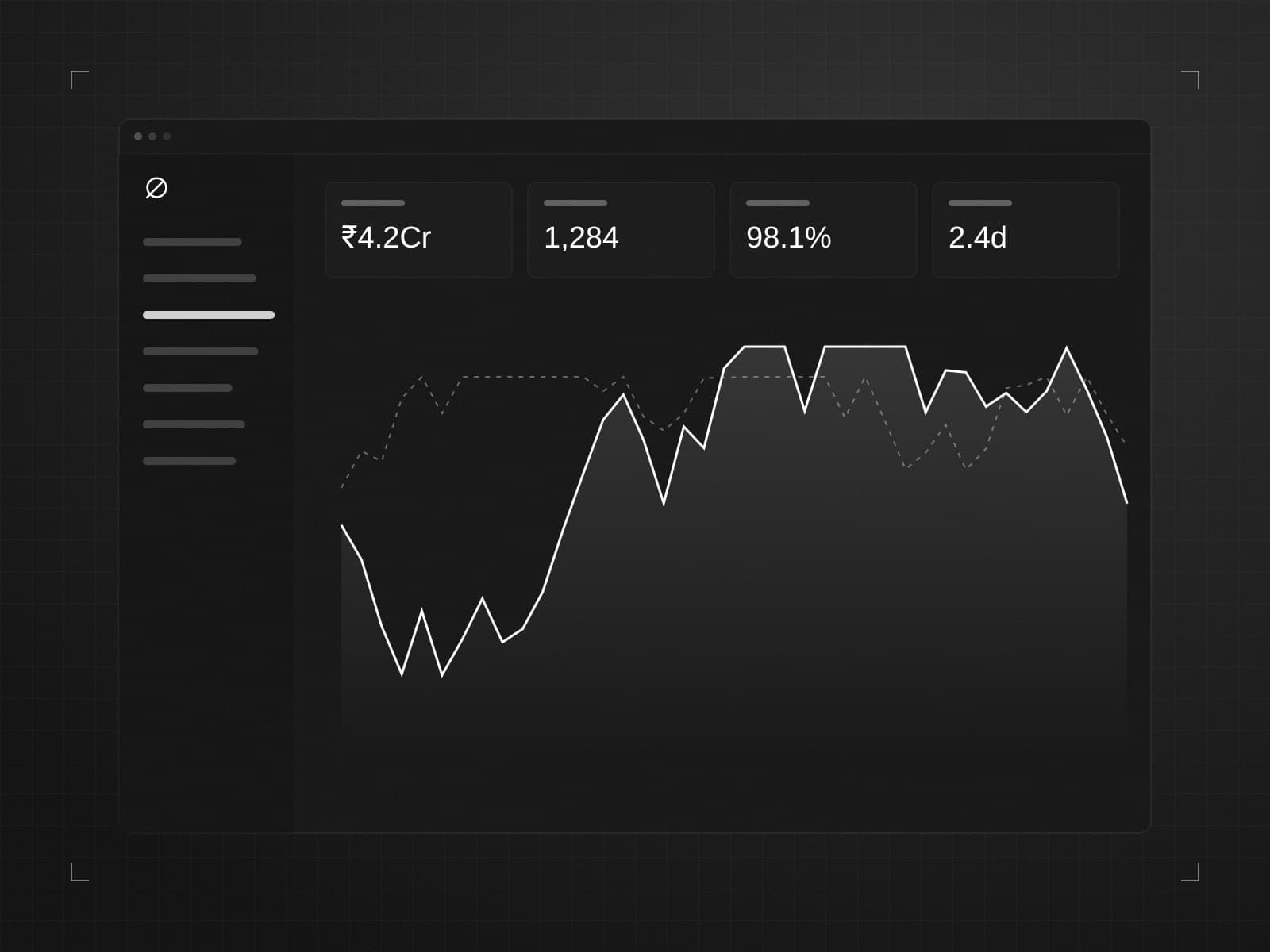
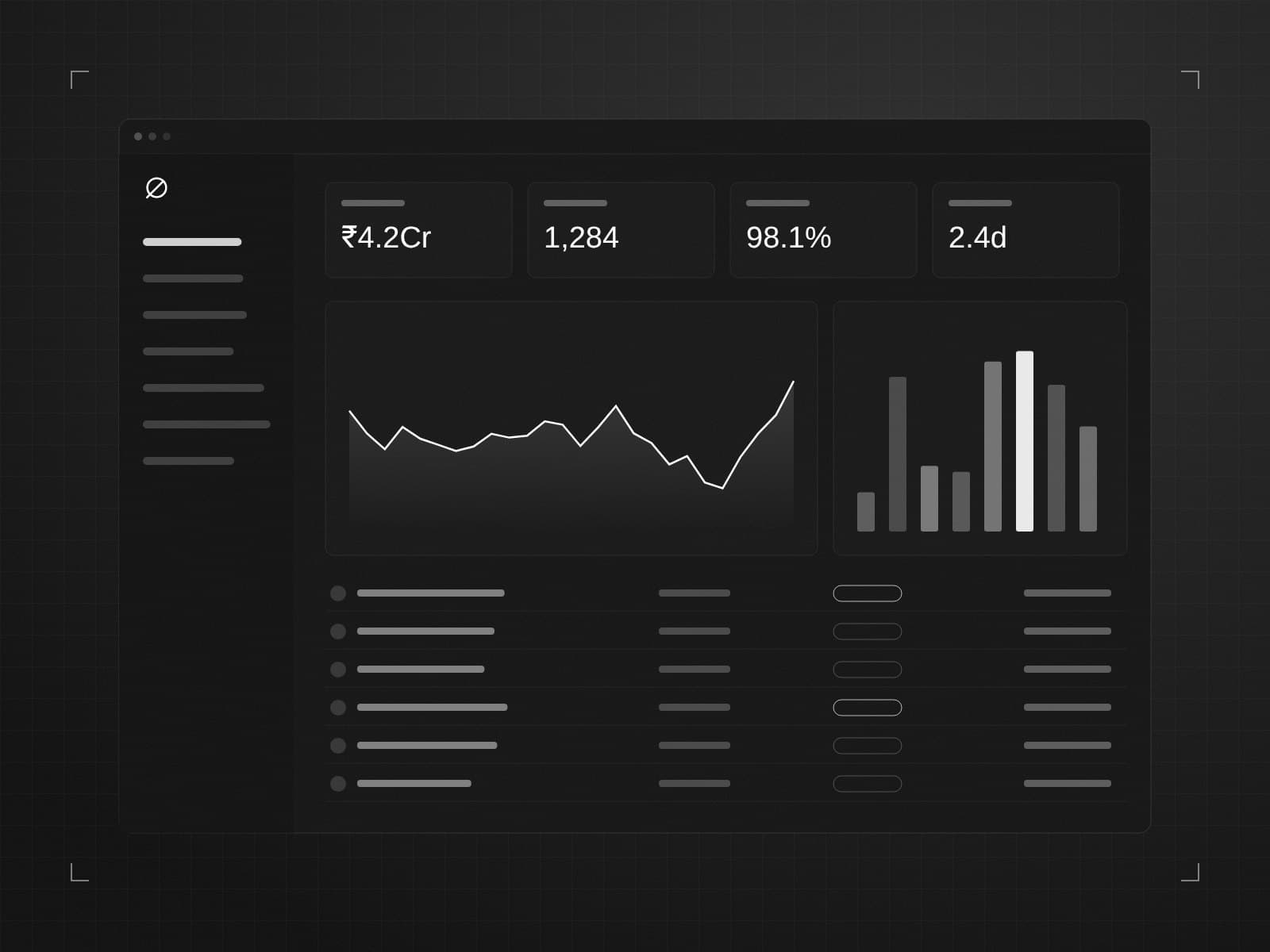
We started by sitting with analysts for a week. The most important finding wasn't technical: analysts didn't need more data, they needed the right data on one screen, in the order they actually make decisions.
What we changed
- One review screen. Applicant, documents, risk signals and history together — no more tab-hopping.
- Keyboard-first. Approve, flag and assign without touching the mouse.
- Shareable state. Every filter and view lives in the URL, so a link is enough to hand over a case.
- A monochrome design system. Colour is reserved for meaning — risk, status, alerts — so it actually stands out.
Under the hood
The new dashboard runs on Next.js with server components for fast first loads, a typed API layer shared with the backend, and streaming updates so queues stay current without refreshing.
The best compliment we received: analysts stopped asking for exports.
Interested in a similar rebuild? Read about our full stack web development and custom software services.